Ten Luminous Notecards

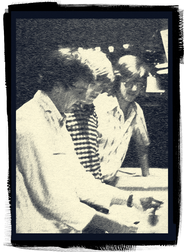
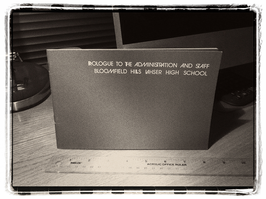
I am a photographer and proud to wear the mantle of a picture maker. But occasionally I don the hat of the graphic designer and create some of the collateral materials that our studio sends out. I became fascinated with graphic design years ago in high school, when I watched my art teacher Norm Stewart produce a booklet titled Prologue to the Administration and Staff: Bloomfield Hills Lahser High School.I remember the excitement of the moment when I opened the first copy, smelling the fresh ink and admiring the elegance of booklet’s design. I knew then that graphic design would play an important role in promoting my photographic work.
Lahser HS Prospectus
Then I went on to the University of Michigan, where I not only studied photography but also minored in graphic design. I remember the hours I put in—between days in the field making pictures and nights working in the darkroom—learning the basics of design, type and illustration. Eventually, as I progressed, I learned how to design logos and ads and even a children’s book. As I think back on that time, I wonder when I ever slept! It was a exciting and invaluable experience that taught me not only the rudiments of photography but also how to create and know good design.
Recently I have been working on the design of a new set of note cards that will present a selection of the images I have been making at White Sands National Monument. For many years I have been creating note card sets on various themes, thanks to an opportunity offered to me by Cottonwood Printing Company. The owner, Victor Scherzinger, took me under his wing. He wanted to create beautiful printed pieces that would showcase the high quality work of his printing company and I needed to find ways to promote my photography. Collaborating with Victor taught me a lot about the challenges of lithographic printing, particularly when it came to faithfully reproducing my images on a printing press. Victor used to say that he was a pointillist; a reference to artists such as George Seurat who used a technique of painting in which small, distinct dots of color are applied in patterns to form an image. Printers translate photographs into halftone dots which makes it possible for them to be reproduced on a printing press.
Creating a bunch of note cards may not seem important, but I have found these miniature portfolios to be a powerful and effective way to share my photographs. People love getting them. These note cards have brought the most amazing people into my life, many of them becoming good friends and supporters of my work. And there have been several wonderful people too, angels really, who have purchased original photographic prints of my work. It has been a worthy effort.
I have learned that the promotion of one's work plays an important and necessary role in the success of an artist. Collaborative partnerships like the one I fell into at Cottonwood have had a huge impact on developing an audience for my work over the years. And when teaching, promotional strategies are an important part of the ongoing conversation I have with my mentoring students. I frequently remind them, as I was reminded by my own teachers, "you can't hide your light under a bushel."

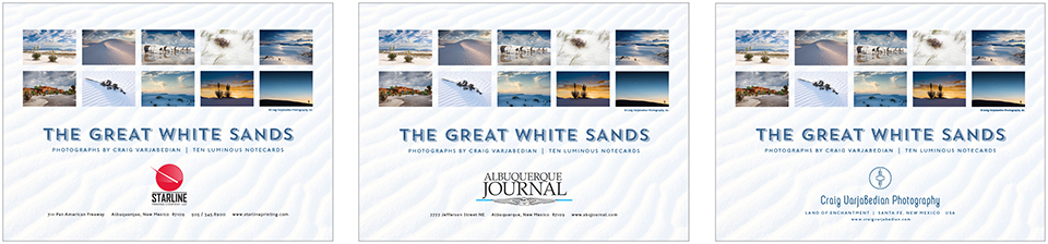
This new set of cards (coming Christmas 2015) will feature a selection of ten of my favorite images from White Sands made for an upcoming book being published in 2017 by the University of New Mexico Press. I am fortunate to be able to work now with Starline Printing Company of Albuquerque, who will also be using the project to promote the quality of work they can produce. The project will also be cobranded with the Albuquerque Journal (the largest newspaper in the state), which will distribute them as well. The new set, by the way, is titled The Great White Sands, a catchphrase coined in the 1930’s by Tom Charles, the first caretaker of White Sands National Monument.
Challenges . . . there were many. Besides designing the actual printed piece, trying to choose among the many thousands of photographs I have made at White Sands over the last several years was a daunting task. Choosing the ten finalists kept me up at night, as I wanted to pick the best, the most beautiful, and the most memorable images for this project. And at times, (while working in Adobe Photoshop), converting the original image files (RGB to CMYK) so they could be printed in four-color made me want to pull my hair out. Some colors would be left unaffected by the conversion, others would become garish. Finally, after tweaking and adjusting, and then adjusting and tweaking some more, I got ten good image files ready for prime time, placed in their appropriate positions within the Adobe InDesign document, and eventually sent on to the printer.

On Friday last, the job finally made its way to the 40-inch 6-color Heidelberg printing press. Scott, the pressman, is an expert at coaxing the best out of that incredible piece of equipment. With his keenly honed skill, the glossy 10pt. Kromekote® cover stock flew through the press in minutes and I stood in awe as I watched that thundering behemoth quickly inhale all that paper and faithfully reproduce my photographs. The results are nothing short of amazing.
I am pleased to have an opportunity to create projects like this. I truly appreciate the kind words I receive from people who acquire these little portfolios. Such unsolicited praise proves that people are seeing my work and engaging with it, for which I am grateful. With Cottonwood Printing closing its doors last year, I was dismayed that my note card project might have finally run its course. I am delighted that the project will continue for another year, thanks to Starline Printing, Bill Lang its owner and Becky Ralston, account executive.